

Pretty in Pink
Pink rooms are charming, but can sometimes veer into the saccharine. We’ve found the trick is to incorporate pink into the design in a way that it can mature with the child.
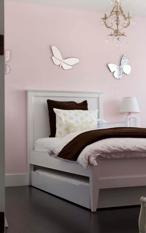
Take your time when choosing the pink, and make sure it isn’t too bright or too saturated. You don’t want it to overwhelm the room. Pink looks sophisticated when paired with a neutral like taupe, greige, cool grey, or rich chocolate. These neutrals can play great supporting roles in the choice of linens, headboards, rugs, window coverings, wall colour, or accessories.
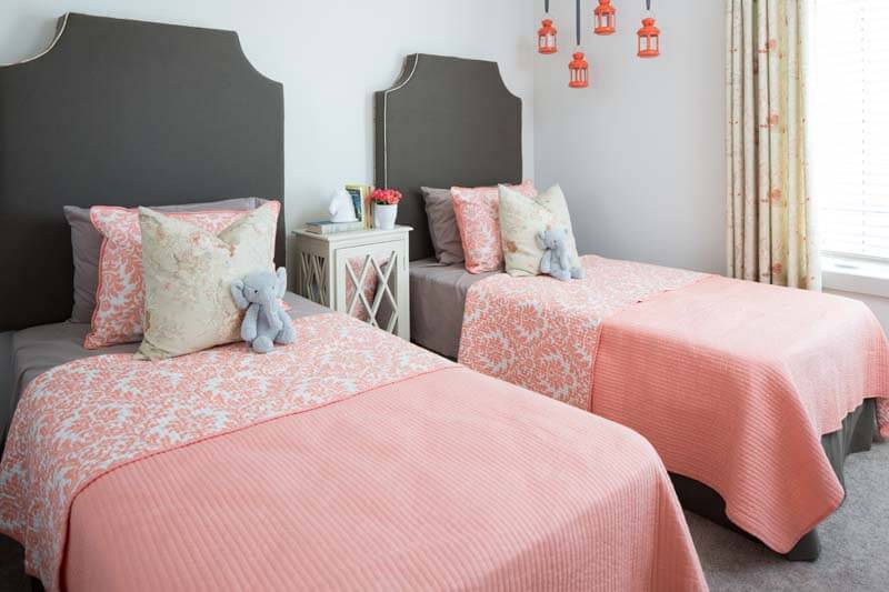
We like to use the 80/20 rule so our rooms feel cohesive. This means 80% of the room is done in the main colour with a 20% mix of the other colours. When planning the room, keep a list of what colour will be used where – wall colour, rugs, and bedspreads are going to count towards a larger percentage than throw pillows or accessories.
Add interest and depth to the room by mixing and matching patterns.
For easy sleepovers as the kids grow, opt for 2 twin beds if there’s space, or incorporate a trundle bed.
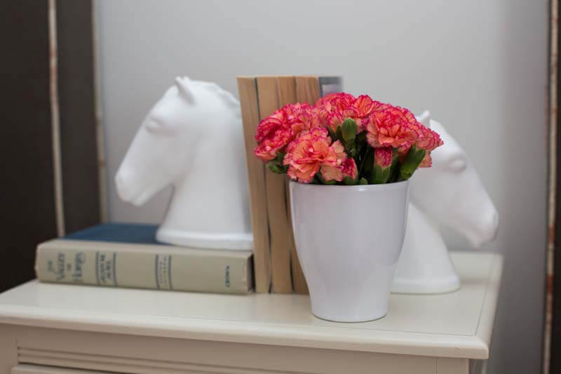
And finally, to really maximize functionality we like to plan for extra guests in the children’s rooms. Sometimes the kids have to make way for visiting friends and family! Ensure there is a light by the bed and a nearby surface, like a nightstand, for setting down a book and a phone.
Pink rooms are lots of fun to design, and when done thoughtfully can easily grow with the child.